I tried something a little different in yesterdays painting in regards to color harmony. I've been studying other artists color choices and thought I'd try a very limited color range on this one. I rather like the neutrals but I feel the red is a bit too similar throughout. It has been a good study though. The neutral tones appeal to me, I think I'll try this again with something other than the red.
Red Mums in a Green Vase 20x20
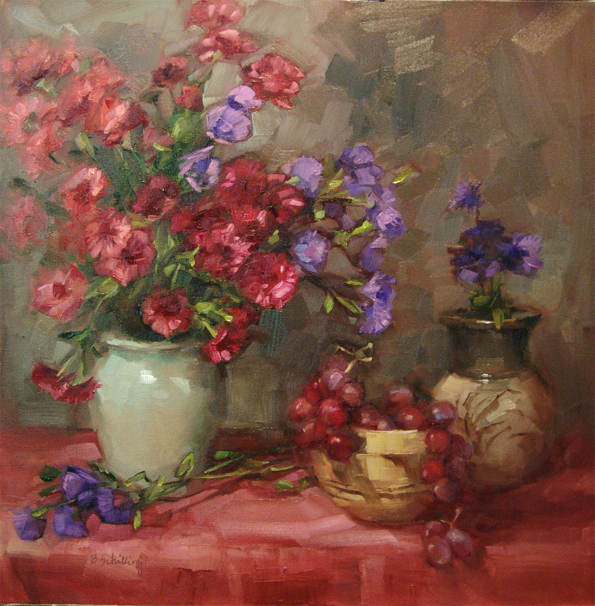
Love the reds with the purples and mauve's, and the way you have handled the background too.
ReplyDeleteThank you Diana! The background went through some changes, I started out with a dark red tapestry in the background, but it was distracting and too much red...I like it much better this way!
ReplyDelete