Tuesday, December 8, 2015

THANK YOU!

"If a Tree Falls...."          18x21"         oil on linen

I have been switching over more to doing a monthly newsletter and spending less time posting a blog.  I wanted to thank each of you for following my work and to invite you to move with me to my Newsletter!
I hope you will join me.  I promise to keep you posted with a monthly newsletter of events and newest painting, and also occasional newsletters for special events.
To sign up just go to my website.......
Then in the menu bar you will see the Email Newsletter.  Click on that and fill in your email address. 
  OR......just click this link and it will take you right to the sign up page! 

Look forward to hearing from you!!!


Tuesday, August 4, 2015

Trumpets

Trumpets

14x22"  oil on linen

Some paintings just seem to "paint themselves". THIS was not one of them!! lol  I struggled and almost gave up on it at several points.  I just really wanted to work it out.  Finally very slowly, it started to pull together.  Sometimes it is worth the effort.

Thanks for viewing my art blog!


Friday, July 24, 2015

Annabelle Hydrangea

Annabelle Hydrangea 16x23"  oil on linen

I had fun pushing the textures on this one.  More abstract shapes than usual. I love to sculpt with the paint, using thickness and texture as well as chroma and value to lead the viewer through the painting..oh yes, and don't forget those beautiful lost edges! :)


Tuesday, July 14, 2015

Frame Makeover

 Refinish those old frames!!

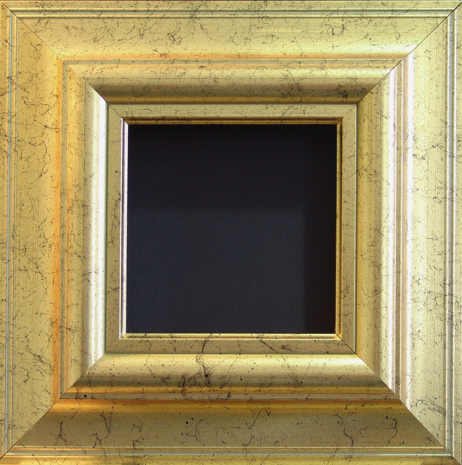
"Cheap" looking metal leaf frame


refinished warm antique black with soft handrubbed patina

As artists we all seem to accumulate those frames that we just don't know what to do with.  They may have gotten damaged shipping to a gallery or banged around transporting to a show.  Maybe they were "ok" frames but the finish just wasn't up to gallery standards or the color just won't work with the art.  
There are many ways to bring new life back to those old frames so they can come out of the closet and hang proudly on your best art!

I have been a fine art restorer for over 35 years and have learned many tricks about refurbishing damaged frames that I would like to share.  Most artists have the ability to refurbish their own frames but they lack the know-how. Being able to modify your own frames can not only save $1000's of dollars, but it can even open a whole new opportunity to the artist to individualize and modify their frames to be one of a kind pieces that will enhance their art. 

I am going to give a step-by-step for you on creating this lovely soft, handrubbed black finish, however, these same steps can be used to modify an existing finish or work with other base colors than just black.....have fun, get creative!
A friend and wonderful artist, Connie Kuhnle, has used some beautiful soft, greyed colors for her charming plein air landscapes.  One of my favorites is her antiqued mustard/yellow on a white and yellow farmhouse...it is perfect!!
I often use antiquing and waxing to add some interest to a newly purchased frame that just doesn't quite have the richness I am looking for.  It is a fairly quick and simple step that can make a remarkable difference.

Tuesday, July 7, 2015

Astilbe My Heart

Astilbe My Heart   18x24  oil on linen

I always choose a strong flower shape, (like a lilac or peony or iris), to put some mass in my composition that automatically tends to draw the viewer's eye.  Today's setup I did not do that.  All the flowers I chose are smaller blossoms or very light airy clusters.  Instead I used the glassware to add the more solid masses.  It is just a little different twist. 
 I used all shades of green in the glassware just for the challenge of getting variety in those subtle differences.

Tuesday, June 23, 2015

Wildflower Bouquet

Wildflower Bouquet  16x20"  oil on linen

I was disappointed this week when my painting day was getting near and I had no substantial flowers in bloom in my gardens.  A few of this, a few of that, but nothing that really seemed like much of a painting.  Finally I decided to just start picking what I could find, threw in a few wildflowers from my walk with my dogs and came up with this wonderful, playful, happy bouquet!  So glad I painted them!

Saturday, May 30, 2015

The Rhode Show

The Rhode Show

20x20"  oil on linen

I've been eyeing my neighbor's rhododendron for several days...wanting to paint it so badly!  Finally was able to get some clippings today!  
I wanted to keep it light and airy, so I worked at staying high key.  I found that the "blocky" shapes in the flowers themselves lent themselves to a little different technique.  I kept the brushstrokes sharp and treated the whole painting as angles and shapes.

Thanks for visiting my artwork blog! 

Tuesday, April 21, 2015

Aurora Geranium

Aurora Geranium 17x24"  oil on linen

I've been keeping my geranium from last season in my house over the winter.  I put it in a north window and didn't expect it to really do much more than survive, instead it thrived!  It was loaded with big healthy blooms but I needed to dramatically cut it back before setting it outside for the summer.  I put all those blooms in a vase and they looked so beautiful (especially to this flower starved gardener!).  I had to paint them.  They last such a long time as a cut flower I'm surprised you don't see them more often in arrangements.

Thursday, March 19, 2015

A Lemon in the Grape Parade


A Lemon in the Grape Parade       12x19      oil on linen

A still life with no flowers!  Just wanted to try some textures with more solid shapes.  I really had fun with this one....Just a bit of a change of pace.


Tuesday, March 17, 2015

Orange Star

Orange Star     16x20  oil on linen

Native to South Africa, this flower really is an "orange star".  It is such a wonderful spark of color in the long enduring winter.  
I worked a combination of brushwork and palette knife for this painting.  I'm having fun pushing the textures ever further.  I love the feeling of dimension you get when you build up the paint.
I'm learning more all the time about creating dimension also with shadows.  Probably the single most valuable lesson I took from the workshop with Laura Robb.  She told me to always be looking for those areas where you can push the value of shadows to give the sense of one thing in front of or on top of another to create that depth.

Thursday, March 5, 2015

DeliStar Mums


Deli Star Mums   15x16  oil on linen

I tried a little different technique on this painting.  Instead of my usual alla prima style, (working wet into wet often mixing color right on the canvas), I worked a bit from glazes and layering.  The mood is a bit more somber than my looser alla prima paintings.  
It is always fun and challenging to change things up and try something new.  
It took a couple days work because I had to let the first layer dry before working over top with the glazes.  
Just a different approach.  I found it easier to control colors but harder to get the transparent colors to be as effective.  It's worth some more studying.


Sunday, March 1, 2015

Turquoise Glass and Roses


Turquoise Glass and Roses  17x17"  oil on linen

There were still a few roses fresh enough to paint left over from the bouquet I painted last week.  The turquoise glass containers are some of my favorites to paint....I love the colors, and I love the shapes.  I've painted them often but don't believe I've ever put them all together in the same painting.  

Thanks for viewing my blog, it's always great to have you visit!


Friday, February 27, 2015

So Sorry!!
Someone hacked my blogspot
Disregard any blog you may have received from my account appearing in German!!Yikes, that was not me.
It has been reported and deleted...hopefully there will be no further issues.
Again, my apologies
Barbara

Thursday, February 19, 2015

Pink Roses

Pink Roses   14x20  oil on linen

Pink roses are so soft and beautiful but they aren't one of my favorite things to paint.  I think they can be a bit "too sweet" looking.  However, I am pleased with the way this one turned out.  The roses at the store just seemed to be the flowers that wanted to be painted.  
I tried to keep the pinks from being too delicate and added some strong brushwork to give it some strength....soft but strong.

Thursday, February 12, 2015

Angel Trumpets

Angel Trumpets     16x30"  oil on linen

It was my goal with this painting to create a more "contemporary" feel to the traditional still life floral.  I do love the traditional florals and think that a good painting is timeless, however, I also find the clean simple lines of the "minimalist" look very pleasing.  It feels sleeker, cleaner....I hope to do more along this line.  Of course, I will still be doing the more traditional florals as well.  I think that both approaches to the subject have their appeal.
Hope you enjoy my interpretation of this different approach to still life florals!

Thursday, February 5, 2015

Red Mums and Strawberries


Red Mums and Strawberries    14x22  oil on linen

As I was working on this painting the strawberries were giving off a delicious aroma!  The first thing I did as a took a break was to wash up a handful and eat them, (not the ones from my set-up!).

In this painting I worked on making certain that there was variety in the reds and in the greens.  The two predominate colors in this set up.  It makes such a difference in a painting to take the time to provide that variety.  In life no two flowers are exactly the same color and the way the light hits the leaves it provides many shades of green as well.  It can take your still life to that next level of professionalism.  

Well, I've got some more strawberries to eat! ttl!


Thursday, January 22, 2015

Triumphs

      Triumphs     
12x24   oil on linen

Tulips usher in Spring here in Michigan so anyone familiar with our climate will certainly realize these tulips came from the florist and not from my backyard!  I got anxious to think of Spring, I guess.  :)
The title Triumphs originates from the name of the variety of tulip but to me it says so much more than that.  The tulips herald the renewal of life after a long cold winter and their bright cheerfulness always seem to me to shout a sort of triumph! 
Life too has those opportunities to triumph...I hope today you can take a moment to celebrate those times (even the little ones) in your life and just shout..."triumph!" 

Blessings to you all and thank you for your support of my art!


Saturday, January 17, 2015

Fireside Teakettle

Fireside Teakettle    20x20"   oil on linen

I've had some requests to post some of my processes so I am going to do a step-by-step of this painting.  The teakettle is an antique given to me by an old friend...I wish I knew the story of it, I've never seen another one like it. 
I hope you enjoy the information on my technique(s)!

No two paintings are ever approached or completed in exactly the same way.  I think it is very important to allow the energy to flow naturally and sometimes that may take a course during a painting that you didn't originally plan.  I think that is not only ok..I think that is necessary if your painting is going to find life.  While the "rules" to painting are absolutely necessary to learning how to create a pleasant and believable work of art, it is with practice that you can learn to bend and remake some of those rules.  That is when an artist truly begins to find their own voice.  That is an evolution that must take place or the artist is simply mimicking  that which has already been said.
There are as many visions for a painting as there are artists to paint it.  The following process is simply my vision.

Let me begin with my palette.  The colors I choose are very important for the technique I use.  I love the combination of transparent and opaque and there are two things you must have to get that effect:
  1. Oil primed linen (I use Centurion oil primed.  I stretch my own canvases so I purchase it by the roll. It is also available prestretched.  I find that Jerry's Artarama has some reasonable prices)
  2. Transparent Pigments.  I have certain colors and certain brands that I cannot paint without.
Most of my colors are Rembrandt unless otherwise specified
          (The brand is important because colors and transparency can vary a lot from one to another)
  Rembrandt transparent pigments;
  • transparent oxide red 
  • transparent oxide yellow
  • transparent yellow light
  • olive green
  • transparent oxide brown
other "must have" transparent colors that I do not have a preferred brand:
  • alizarin crimson permanent (make sure you are getting one that is permanent, the older alizarin crimsons would fade with time)
  • ultramarine blue
  • quinacridone rose
  • viridian green
These are my initial layout and block-in colors.  I do not use any opaque pigments at this point.
I do not use all these colors for every painting it depends on the color harmony or local color of the objects for each painting.
Opaque pigments;
  • Titanium white (I prefer Rembrandt, but use others too)  Any time you add white to a color it starts becoming more opaque...the more white the more opaque.
  • cadmium lemon yellow
  • cadmium yellow medium
  • cadmium red light
  • yellow ochre
  • cobalt blue
  • dioxazine purple (sometimes)
  • burnt sienna
Mineral spirits is my primary brush rinse and thinner although I may use some liquin as I progress to the final stages of the painting.

I like to keep my brushes sharp (chisel edged).   I use almost all Silver Bristlon Brights or angled (these are a little harder to find) I like a semi-stiff bristle. If I want to "scrub out" a larger area I will use a natural bristle bright as they are stiffer and tend to be more durable for that rough treatment.
It is hard to keep brushes sharp for long and I do replace them every couple of months.  
I learned a technique from Daniel Keys for putting a folded cardstock over the tip and securing with a bulldog clip.  It does help but you have to do it carefully or you can really mess up the bristles! 

Ok..lets start painting!!

When I start a painting I like to imagine the flow of the design.  My initial marks are following the eye path I wish to create.  Then I will start loosely sketching some of the more precise shapes so I get them right.  I have started with transparent oxide red and ultramarine blue on this one. 
 

now I have started adding local color to the objects, although I am still just viewing them as shapes and not as specific objects. 

All The colors used at this point are transparent.  I am judging my middle value of each color for the most part.  Where I want to create lighter values I either "scrub-out" with a paintbrush or wipe-out with a paper towel.

All my canvas is covered now.  I find white areas distracting and like this stage when the painting is starting to feel like it is getting somewhere.

Here's where volume starts.  I begin usually at my determined focal point.  That way I can decide as I go along how much I would like to abstract the secondary objects.  Simply adding white to some of my mixtures will give me the correct opaque color for my higher value areas.  Areas that will remain darker in value but still want a sense of solidness to them (like the teakettle) will require using a mixture of my darker opaque pigments.  Yellow ochre works well for this as does burnt sienna.  A very dark, opaque color can be acheived using burnt sienna and ultramarine blue.

As I continue to add opacity I create more volume in my shapes and more importance to the areas I wish to lead the eye throughout the painting.  At this point  I call it my "push and pull".  I wipe out where I feel I've added too much detail and it is distracting to my focal point.
My opaque areas are also where I usually apply my thickest paint. sometimes putting it on so thickly that I can almost sculpt with it to create form.  I only do this where I want the most important parts of my painting to be.  The point of interest.

 Although I am working on the background throughout the painting process it is important to really evaluate how it is interacting with the objects as the objects are becoming more solid.  You may want areas of the background to remain transparent but you also want it to feel "real" where the light may be bouncing off it.  

 scrub out...add in..hmm..scrub out again.  This process requires some courage.  if something isn't working, it doesn't matter how "nice" it is, sometimes it just has to go.  A painting is not about one beautiful passage it is a part of the story as a whole.  If that precious passage is not right for the painting...off with it!!!  It's only paint after all.  

 Now I must make a lot of decisions.  Where to darken, lighten, add detail, subtract detail, balance some color, readjust some compositional elements....a lot of stepping back and just looking.  Walk away and come back.  Look at it through a mirror.  Stand on your head to look at it.  Whatever it takes to help you see it with a different perspective.

I step back, I leave it for a day, I think it's done.  Oops, the bottom left corner is too warm...I'll adjust that.  But overall I feel satisfied.


Wednesday, January 7, 2015

Mule Deer

Mule Deer 18x24  oil on linen

I gave myself a challenge with this one. 
 I haven't done a lot of wild life in my landscapes but wanted to have a go at it.  It was exhilarating, as most new challenges tend to be.  It was so fun, pulling out the stops and throwing on some textures and strokes to add interest! 
 The original photo reference came from a hike in the mountains in Colorado.  It was so special to encounter Momma and her twins.  They seemed to be curious but not really afraid of us.